I went on the website www.issuu.com to look at on-line magazines to look into the way different magazines lay out interviews, products etc.. I looked more into rock n roll type of magazines as the artist I was working with specialised in that genre of music so I wanted to get a good insight on how to lay out my work.
Melodic Rock Fanzine
The first on-line magazine I looked at was Melodic Rock Fanzine. This magazine was mainly based around interviews and reviews on certain bands/artists. This January 2012 issue included reviews and interviews of Primal Fear, Mollo Martin, Michael Thompson Band, Mark Spiro, Dragonland, Chris Ousey, Sonic Station, Sunstorm and many more!

Just from looking at the cover of this magazine you can see it's genre of music is quite heavy and rock n roll. This magazine would be aimed at people aged between 20-30 years old who are into this type of music. The bands/artists that are shown on the front cover look like the kind of people into heavy music, also the clothes that they're wearing, black leather jeans, jackets and tops suggest they're quite rock n roll. The whole front cover is quite dark with colours such as black, grey, white, brown etc. However they use the colour red to brighten up the main aspects of the front cover so they stand out to the people looking at this magazine. The name of the magazine is in red so this will stand out from other magazines so people will see this straight away. The font of the writing on the front cover is quite big and bold, they also have a shortened version of the magazines name, "MRF", which takes up a big part of the front cover of the magazine which will stand out and catch peoples attention. It also isn't too cluttered like other mainstream magazines, which sometimes attracts more people due to it sticking to a few main stories/bands, the ratio from text to images is 3:7. I think this magazine cover fits what type of genre it is based around with the different aspects of the front cover.

This is a main two page spread on a band called 'Primal Fear'. This band was shown as the front cover so it indicated to the people looking at this magazine that there would be a lot more about them within this magazine. The basic layout of this subject includes one photo of the band, the name of their new album, an interview with the band and a review of the band. The style of this page is very big and bold which fits the running theme of the magazine. It is also mostly writing with the odd picture of the band and their album, the ratio of writing to photos is 8:2. Although most of the page is quite light with the colour of white, the way the writing is laid out still indicates its a rock n roll type of magazine with the blocks of writing laid out side by side. The magazine also has a jagged framing around the edges with the cover of their album as the background which makes the page look more rock n roll instead of a clean cut page. I think it is really effective as it suits the lay out as well as the lay out is really plain so it adds more to it to make it look busier.

I noticed a running layout within this magazine, its very clear with what the magazine is trying to get across to the readers. It clearly states what band/artist they're talking about, the name of their album, and the people who interviewed them. They have a clear photo to indicate who the magazine is based on then about a third of the page is an interview done with the artist/band asking about their new album etc.. Also, I noticed at the bottom of each article there is a review on the band and their personal opinion, this expresses to the readers what they really like about the band/artist etc.. I think the stylistics of this magazine suit the target audience as the dark colours, the genre of bands/artists, the layout etc. fits exactly to what the magazine is about and whos in it.
This magazine also has a page for new releases of albums that are quite popular. The layout of this page is quite easy to read, the simple pictures of the album with a bit of information about the band/artist and album. The colour of the page is mainly blues and green with the firing orange title, 'New Releases' which will catch the attention of the reader to look through and maybe buy one. The dark colours used also relates back to the genre of the magazine, being a quite heavy metal, rock n roll, magazine. You wouldn't see colours like pink in a magazine like this as it isn't relevant to the theme. The bold font for the main parts like the titles, name of band/artist, album name etc. make the main facts stand out from the rest so instantly looking at this, you'll know what its about. The little bit of writing about the album is all centred which I feel makes it easier to read, also the colour of this is white which is another way to make it stand out against the dark backgrounds.

Metal Hammer 222 Sampler
The second magazine I looked at was Metal Hammer 222 Sampler. This magazine is the UK's only monthly hardcore metal magazine accompanied by a gift every issue. Covering both traditional and comtemporary metal bands, hardcore, gothic rock, punk and alternative, you'll also find reporting on the burgeoning British scene as well as all the latest bands Stateside and around the world. There's comprehensive news and reviews sections and in-depth interviews with upcoming stars on the scene and more well known acts. Metal Hammer is loud, rude and makes no apologies. The target audience for this magazine is for more teenagers, the age range would be 15 to 25 year olds. The layout and bands seem to be more this age ranged.

Just by looking at the front cover and the name of the magazine it is clear to see what type of music this is involved with. The front cover layout is very similar to main stream magazines that you would see on the shelves in a shop, however the first magazine was very different in the way it was laid out. The way this layout is very effective in catching peoples attention is all the main information about the magazine is all at the top. Magazines tend to do this because the way magazines are laid out on the shelves the top of the magazine is the first bit you see so if someone was just scanning the shelves and see "Judas Priest" above the name, you'd know straight away there is going to be an article on them in this magazine. The font on this magazine is quite bold and square, it is also all in capitals which is done on most magazines to make it stand out. The colour of the magazine is mostly dark colours like dark green, black, greys etc. which fits perfectly with the genre of this magazine. Although the colours are quite dark and boring, the front cover is still really interesting with the different fonts that are used, for example, the font for 'Machine Head' looks like its been drawn on there by someone and also, the guy on the front cover represents the heavy metal that he is into with the way he is dressed, his tattoos etc. There is little text on the front cover, just the main name of bands that are involved inside of the magazine and the gift that comes with this magazine, its only little text but it grabs the attention of the audience because they might be interested in these certain things.

This is a main article from the magazine. I feel the layout of this magazine would suit some people better than articles with lists of writing, the ratio of images to text would be 6:4 and I feel some people, especially the target audience for this magazine, would prefer looking at images instead of reading massive amounts of writing. The layout is also very interesting to look at with the smaller images of the band performing etc so this shows of the band in a good way. The framing of the photos also makes the layout more funky. Although the colours used aren't very dark which you could expect from a heavy metal band, the colours they use, such as red, green, white etc work well with the layout. I think the element of the heavy metal you get from this is the type of font they use, its quite big and bold and stands out when you look at the magazine.

This is another article from the magazine about a heavy metal band. The layout of this article is very interesting in the way the cool pictures and writing make it. Within the lay out there is three photos which introduce the three different guys in the band and shows of their image so you get an insight to what they're about. There is more writing in this article than the one before, the ratio of text to images in about 5:5 which I feel will still work with the audience as the it is very interesting. The colour of the page is quite gloomy, you get that ghost effect which is shown on the main headline on the first page. This page is based around more darker colours such as grey, black, whites and blues, this could reflect the type of music they're in to.The colour of the pictures is also shown in the writing with the colours they are. The font they use for this article is bold and big like all articles so it stands out. As I mentioned before, they have the like ghostly effect over the 'Stand and deliver' headline which relates to the picture behind it with the outlines of their bodies reflected on the wall but cant actually see them.
This page is a comedic page in a way to entertain the readers. It carries on the element of a music magazine but shows certain people answering what album they'd like played at different events. The elements of heavy rock in this is shown in the title, 'Discs of Doom', you wouldn't see this as a title in a girly magazine. This page is very similar to the page advertising albums in the other magazine I looked at. Its laid out in three different bits where as this is the question, the person answering it, then there answer. The layout of this page is set out so its an easy read, everything is laid out that you would understand where to look for the information you want to know straight away. The pictures of the albums are also a good indication of what you're looking for and whats going to be included. Once again, the font they use is big and bold, also on this page it is 3D which makes it stand out even more. The colours also keep to the theme of the magazine with no major bright happy colours, just the colours of grey and black to keep to the heavy metal element.

Posters
While research different magazines, I also looked into festival posters, which would be advertised in these sort of magazines, and looked at how they were laid out. I looked into heavy metal sort of festivals so I could relate it back to what I had already looked at within my research.

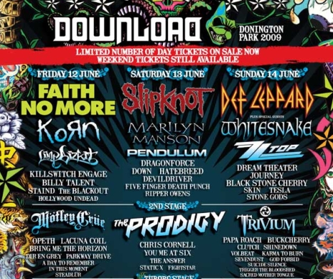
This poster is for the Download festival, the bands that play at this festival are more rock and roll, heavy metal type such as Slipknot, The Prodigy, Pendulum etc. The lay out is typical to any other festival line up. However, although the writing font that is used is the bands own, it still relates to the genre of music they're revolved around which helps to add to the poster/festivals theme. The elements on the page are also out of the ordinary, which the things rock n roll artists do can be seen as different sometimes, so this relates back to that. This is a very colourful poster with the different and random creatures around the edge of the poster, I feel this works well as it makes the poster stand out so it catches your attention but also adds to the rock n roll theme.

This is another festival poster for the Ozz Fest. This festival is a much more heavy metal festival than the download festival. It is clearly shown on the poster by the different elements. The picture on the poster for example shows its a bit mental with the scary skull face and the bands/artists that are playing. Also, the colours are quite dark colours compared to the previous poster, for example, dark reds, black, dark yellow. This shows more elements on a heavy metal festival as its not all happy and bright. The font of the poster is also again big and bold so it stands out but also it seemed to be a running element in these sort of genre of posters and magazines etc.


No comments:
Post a Comment